Does the new Google Chrome logo fall flat?
We’ll be honest, we are sucker’s for a good logo update or redesign. As times change, so should your branding. Falling behind and looking “dated” can at times have a negative impact. Companies large and small are getting on board to understand the many benefits of updating their branding.
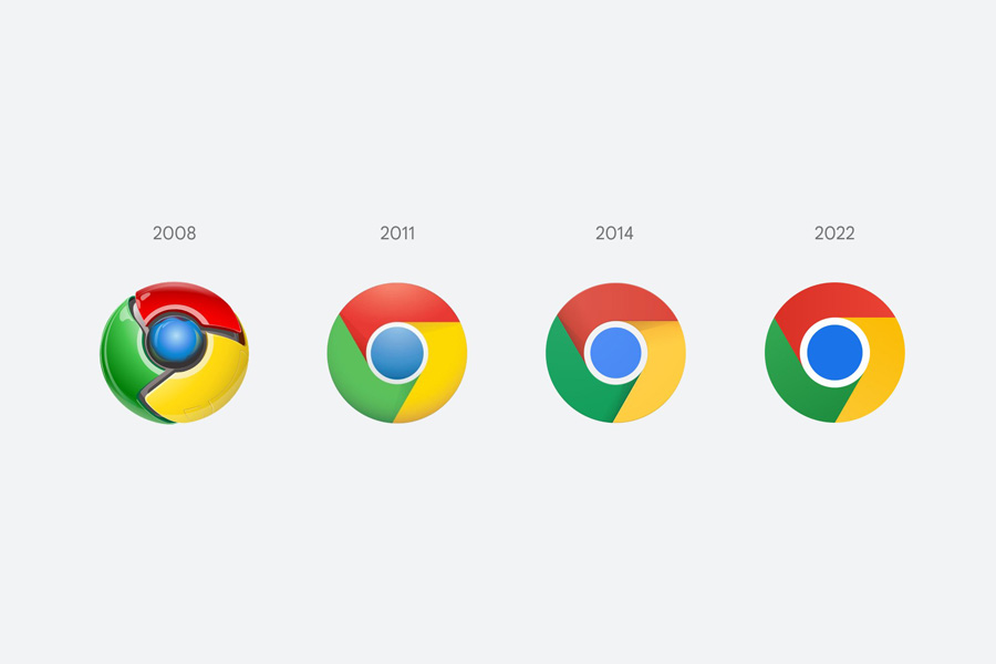
A designer for Chrome tweeted the new logo design, along with a bunch of tidbits about how the design will appear on various operating systems. But apart from the removal of the shadow and some slightly brighter hues, it’s not exactly clear that a huge amount of change has taken place.
The most notable change in the design, shared by Elvin Hu, is the removal of those shadows. But while the change removes any 3D aspect from the icon, it’s hardly a groundbreaking change, but that’s not necessarily a bad thing. To be honest, when you look at all of the logos since 2008 side-by-side it does show just how much icon design has changed in 14 years.
Brand recognition is always something companies worry about with a rebrand. Will people still know who we are if we change our logo? That’s why sometimes, subtle changes can be just as impactful.
Companies are updating their branding more than you might think.
GM is one of the larger companies to recently updated their branding. GM joins the ranks of many other car manufacturers who are stripping down their branding to usher in a new electric and digital era. Flatter, sleeker, and more streamlined, the new lowercase GM logo is said to represent the ‘clean skies of a zero-emissions future’ and the ‘energy of the Ultium battery platform’.
While the logo has been mostly well received, it has it fare share of critics as well. Change can be hard for people and everyone will have an opinion one way or another. Stick with your gut and commit to the change.
To see some other examples of recent logo updates, take a look here.